At a Glance


The Brief
A Kansas City
tradition.
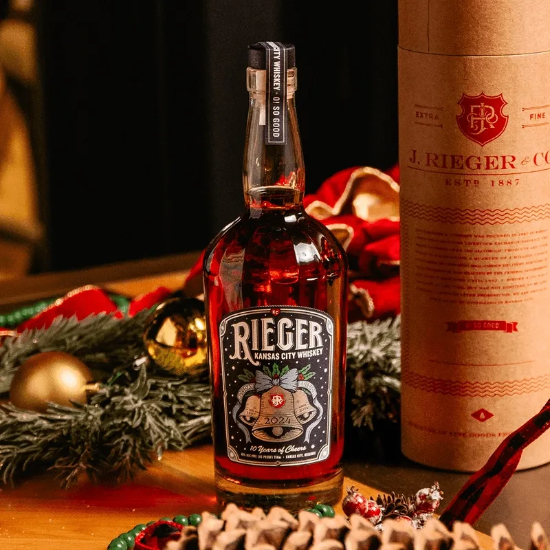
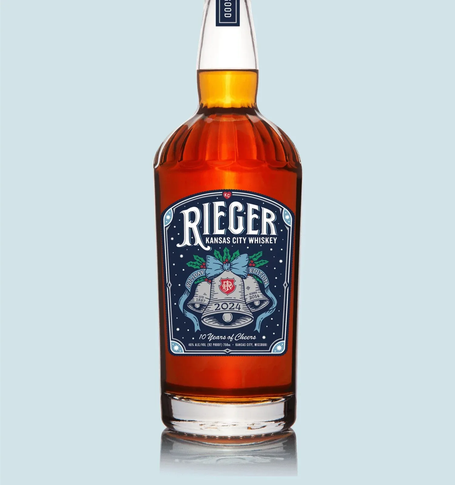
This 10th edition label marks the first time the holiday label featured a nighttime scene.
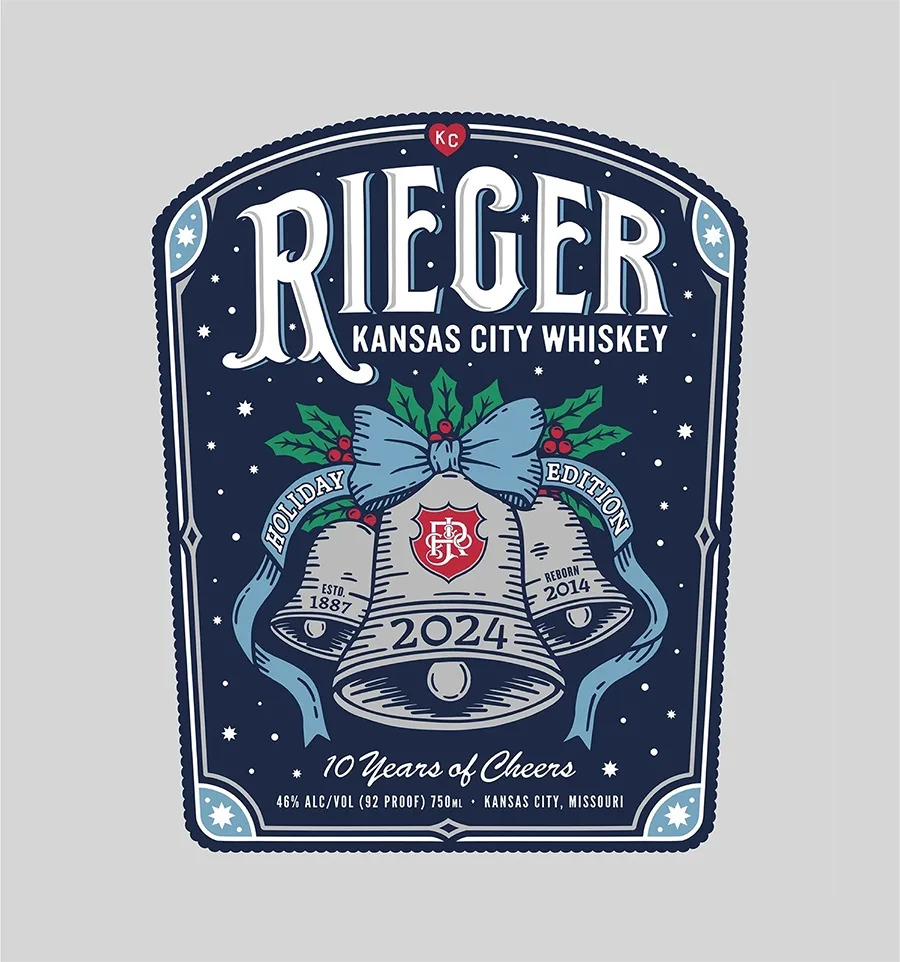
The focal point, a trio of silver foil-stamped bells, pays homage to historic illustrations from the brand's pre-Prohibition history, creating a bridge between past and present.
-
A Hand-Drawn SpiritApproaching this project with an illustration-forward mindset was imperative. It needed to look handmade and feel handmade, to match its handmade taste.
-
A Historic FirstThe previous nine editions of this label featured daytime scenes. For the 10th anniversary, I designed the first label staged at night which created fitting backdrop for a milestone edition.
-
Legacy ReferencesThree dates are included on this label: the original pre-Prohibition establishment date, the reopening, and the current printing year. These dates, paired with bells, holly, and ornate typography inspired by an old Rieger advertisement, retell the story of Rieger in a concise and beautiful way.
The Label
Past and Present.
Same bottle.
Concept Development
Finding the
final bell.
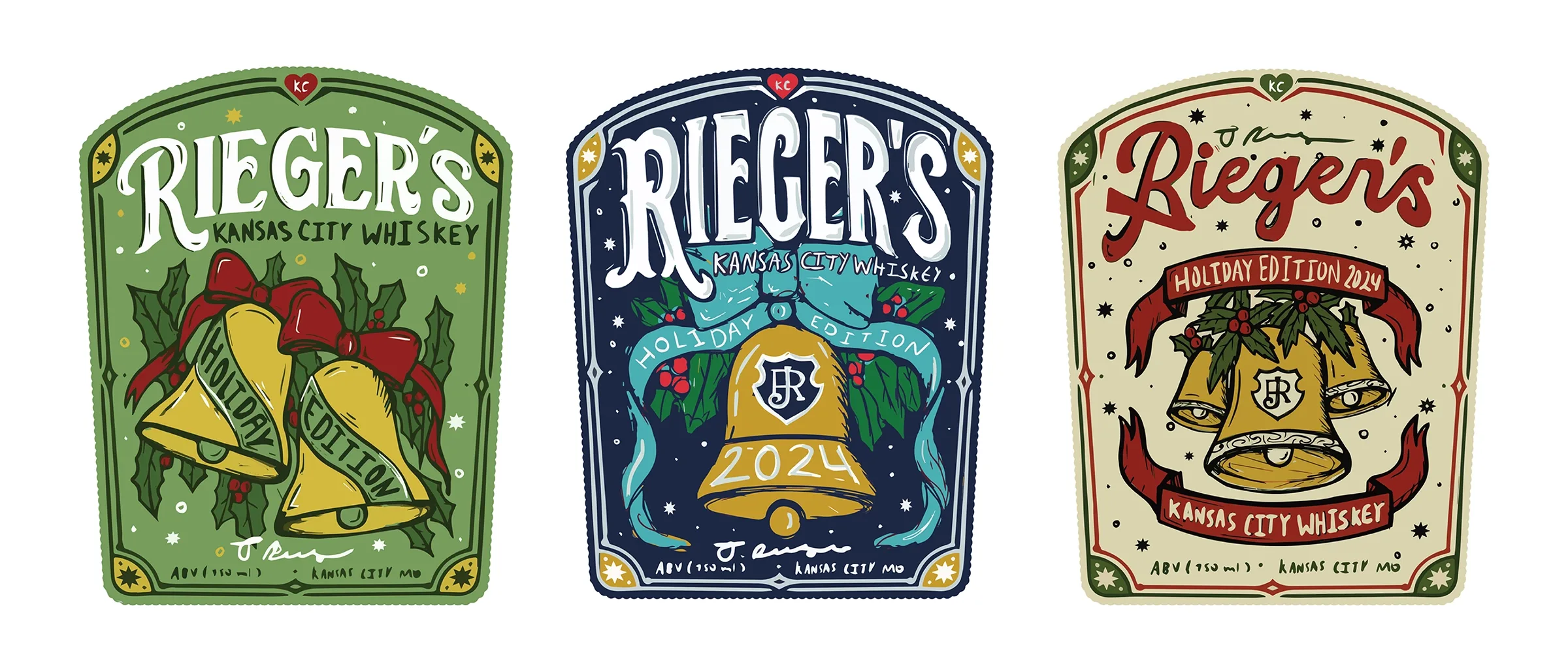
Early sketches exploring the bell illustration before landing on a final direction.
Historic Inspiration
Where the
bells came from.
The Source
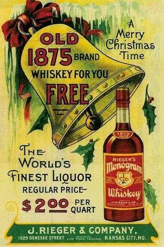
This vintage poster and printed materials advertise various holiday references from Rieger's pre-Prohibition days, featuring old-school holiday bells, holly leaves, and Victorian-era ornamental typeface.
It was important to capture the original holiday magic from these historical references while making it feel relevant for today. The bell became the focal point of the label, with ornamental typography and holly imagery supporting the composition and reinforcing the festive quality of the release.
The Outcome
A label worthy of
the 10th edition.
A timeless limited edition label that bridges Rieger's past with its modern shelf presence.